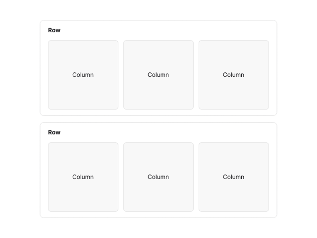
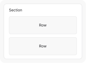
Row & Column
Build layouts by grouping content into rows and dividing them into columns for precise structure and alignment.
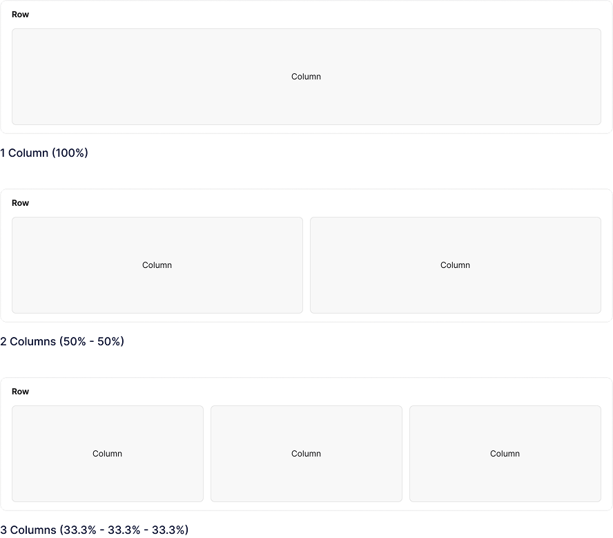
Column Structure
Use built-in column layouts to structure your content with different column counts and widths.
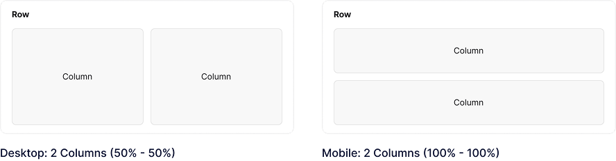
Column Responsiveness
Customize column widths across five breakpoints to ensure responsive layouts.
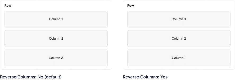
Reverse Columns
Reverse the order of two columns within a row on mobile devices.
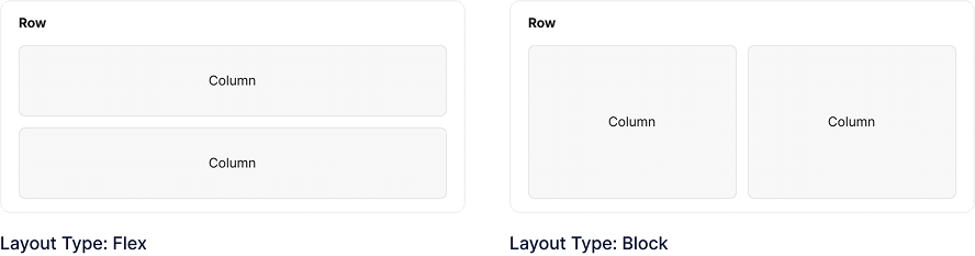
Row Flex Layout
Arrange columns within a row horizontally or vertically, with full control over alignment and space distribution to build flexible, responsive layouts.
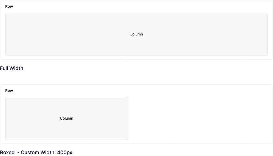
Row Content Width
Set content to full width or define a custom width within a row.
Full Height Row
Make the row fit the full height of the browser window.
Full Height Row
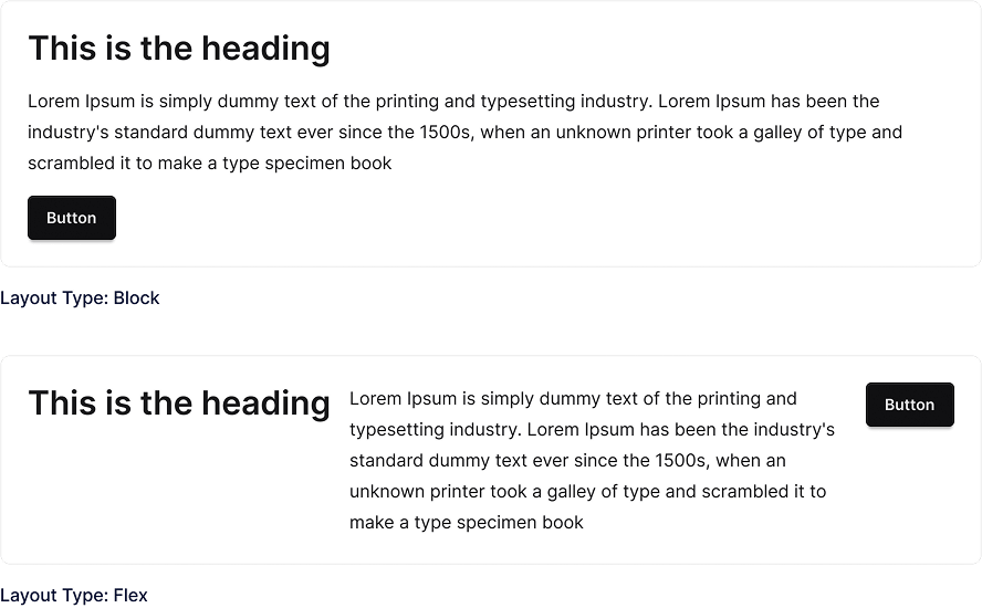
Column Flex Layout
Arrange blocks within a column horizontally or vertically, with full control over alignment and space distribution to build flexible, responsive layouts.
Explore More Blocks

Build Stunning Content With Page Builder
30-day money back. Free lifetime updates