Accordion
Organize content into collapsible panels to save space and improve clarity.
Accordion Items
Create unlimited accordion items, each with a title and content.
Accordion Type
Support two accordion styles: Separate (adds spacing between items) and Join (removes spacing between items).
Type: Separate
Type: Join
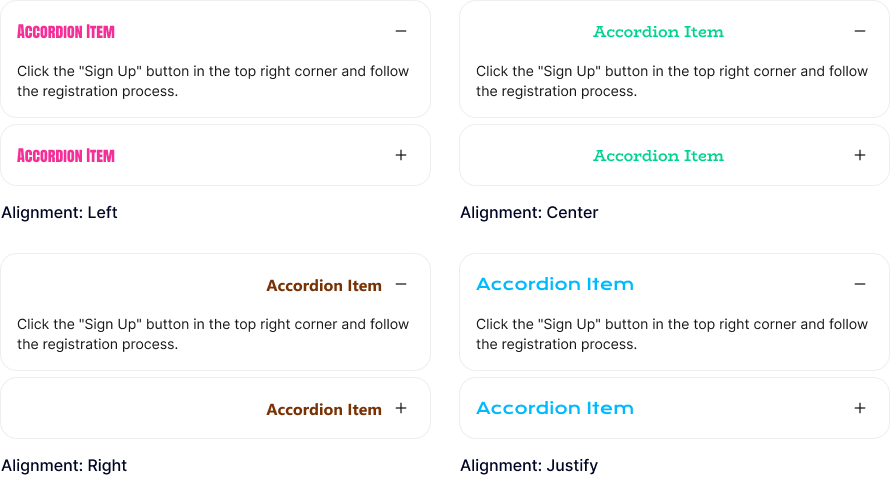
Accordion Item Title
Add a title to each accordion item and customize its alignment, heading tag, typography, and text shadow.
Accordion Item Content
Build accordion content using blocks from the block library, with control over content padding and background color.
This is heading element
This is heading element
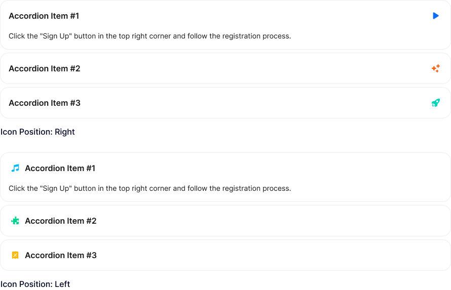
Open & Closed Icon
Add icons to accordion items for both open and closed states, with customizable color, size, background, border, and rotation. Icons can be placed on the left or right of the title.
Active Accordion Items
Control the accordion items that are expanded when the page loads.
Active: Accordion Item #2
Active: Accordion Item #3
Only One Accordion Item Open
Allow only one accordion item to remain open at a time. Otherwise, multiple items can stay open.
Accordion Item Gap
Adjust the spacing between accordion items.
Animation Duration
Set the animation duration for expanding and collapsing accordion items.
Accordion Item Border
Customize the accordion item border with style, thickness, color, and radius options.
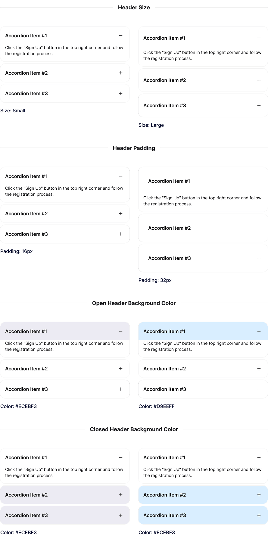
Header Styling
Display accordion item headers in small or large sizes, customize padding, and set different background colors for open and closed states.
Explore More Blocks

Build Stunning Content With Page Builder
30-day money back. Free lifetime updates