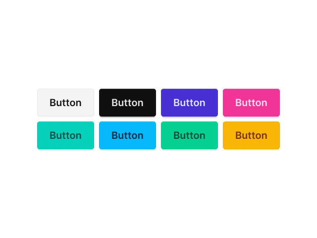
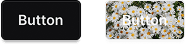
Button
Design eye-catching buttons to drive clicks and user actions.
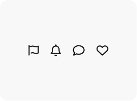
Icon Position
Place the icon above, below, to the left, or to the right of the text.
Icon Spacing
Control the spacing between the icon and text.
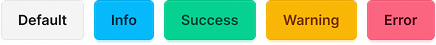
Button Type
Support 4 pre-built button types: Default, Info, Success, Warning, Error
Button Style
Support 4 pre-built button styles: Default, Outline, Ghost, Link

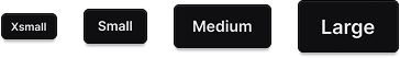
Button Size
Support 4 pre-built button sizes: Xsmall, Small, Medium, Large
Background
Set the button background using a color or an image.
Explore More Blocks

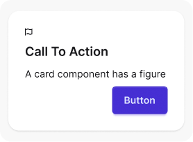
Build Stunning Content With Page Builder
30-day money back. Free lifetime updates