Divider
Display lines to visually separate content and improve readability across your layout.
Title
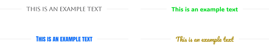
Add a title to the divider, choose an HTML tag (H1–H6, div, span, or p), and customize its link, typography and text shadow.
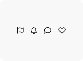
Icon
Add an icon to the divider from Awesome or Open Iconic library and customize its color, size, border, background, and rotation.
Type
Display the divider horizontally or vertically.

Color
Set a custom color for the divider line.
Color: #4338CA
Color: #
Color: #
Color: # Choose from 8 styles for the divider line. Dotted Groove Dashed Ridge Solid Inset Double Outset Style
Weight
Control the thickness of the divider line.
Line Weight: 3px
Line Weight: 14px
Line Weight: 20px
Width
Customize the width of the divider line.
Line Width: 300px
Line : 500px
Line Width: 800px
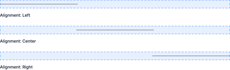
Alignment
Align the divider line left, center, or right.
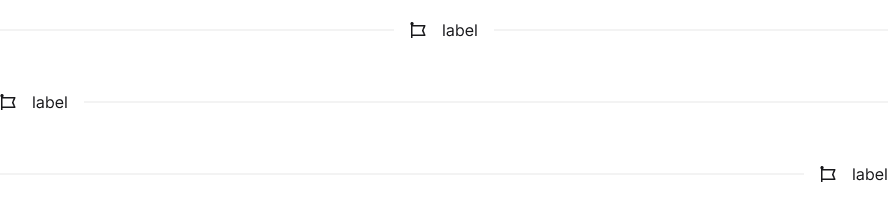
Icon & Text Position
Position the icon and/or text on the left, center, or right of the divider line.
Icon Spacing
Adjust the spacing between the icon and the divider line, and between the icon and text when text is added.
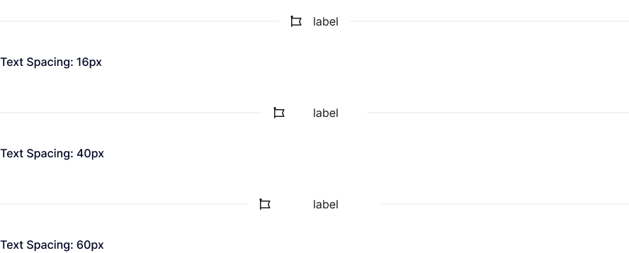
Text Spacing
Adjust the spacing between the text and the divider line, and between the text and the icon when an icon is added.
Explore More Blocks

Build Stunning Content With Page Builder
30-day money back. Free lifetime updates