Design Once. Perfect on Every Device.
Create responsive content visually and preview it in real time for desktop, tablet, and mobile.
Consistent Design Across All Devices
Maintain a polished, consistent look on every screen size without worrying about broken layouts.
Less Guesswork, Faster Adjustments
Preview and tweak responsive settings live, so you can get it right the first time and avoid unnecessary rework.
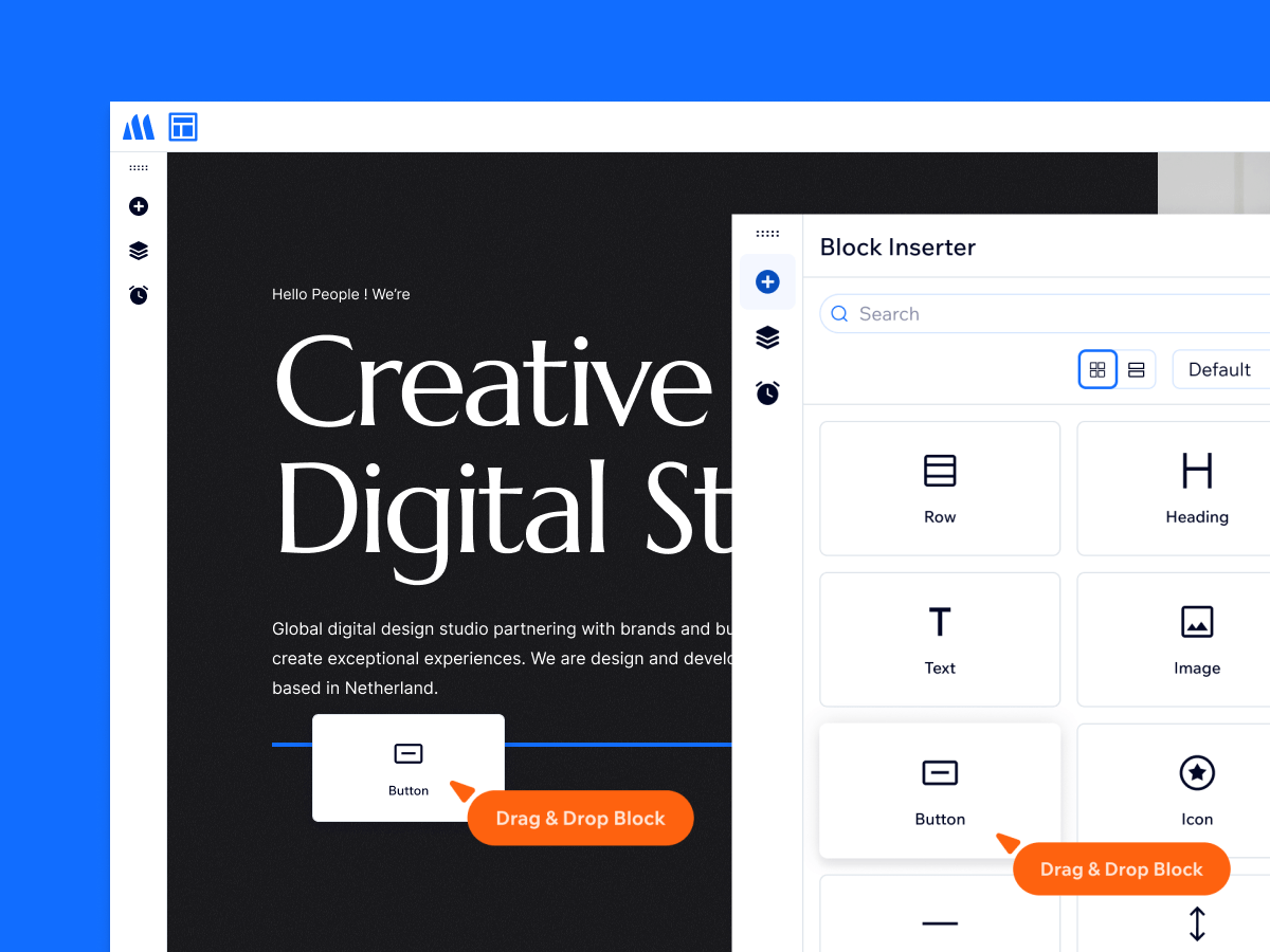
Precision Control Without Code
Customize how your layout behaves on each device with granular controls—no custom CSS, no complexity.
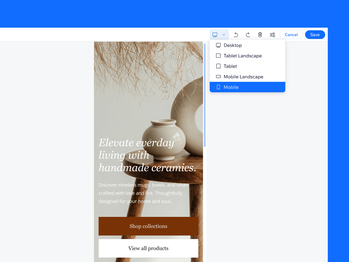
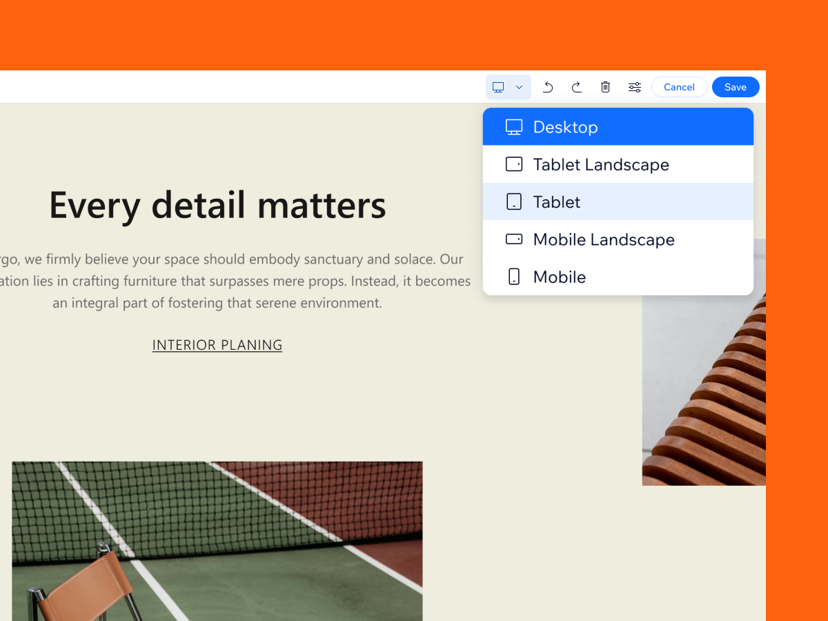
Live Preview Across All Devices
Switch between 5 device views—Desktop, Tablet Landscape, Tablet, Mobile Landscape, and Mobile—to preview your content in real time.
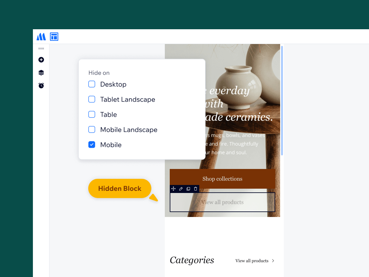
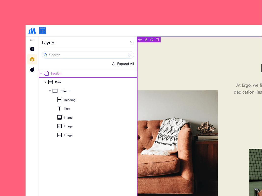
Block Visibility
Control block visibility across devices—hide blocks on selected screens without affecting others.
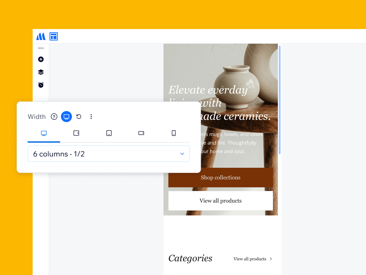
Column Responsiveness
Change each column’s width per device to ensure your layout looks perfect on every screen size.
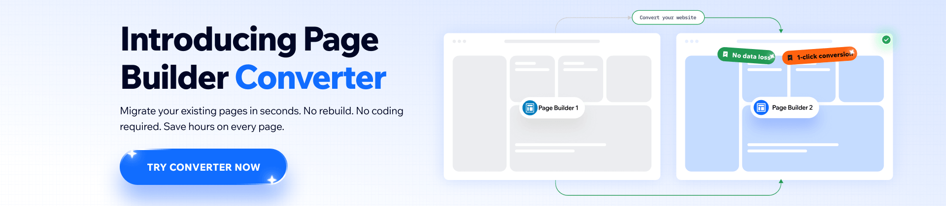
Explore More Features
Build Stunning Content With Page Builder
30-day money back. Free lifetime updates