RESPONSIVENESS CONTROL
- MAGEZON PAGE BUILDER -
Introduction
As customers use different devices to shop online, the top concern of web owners is that their website is easily accessible no matter what device it is.
Understanding this, Magezon Page Builder gives you full control over responsive design so that your websites will look perfectly on any screen size. Of course, no coding skills are required.
We’ve discussed Responsive feature with overview information; and in this post, we’ll give you more details on responsive options that Page Builder provides.
Magezon Page Builder allows you to control the responsiveness on 5 screen sizes:
DESKTOP
(>=1200px)
TABLET LANDSCAPE
(<1200px)
TABLET PORTRAIT
(<922px)
MOBILE LANDSCAPE
(<768px)
MOBILE PORTRAIT
(<576px)
Control Column Size on Different Devices
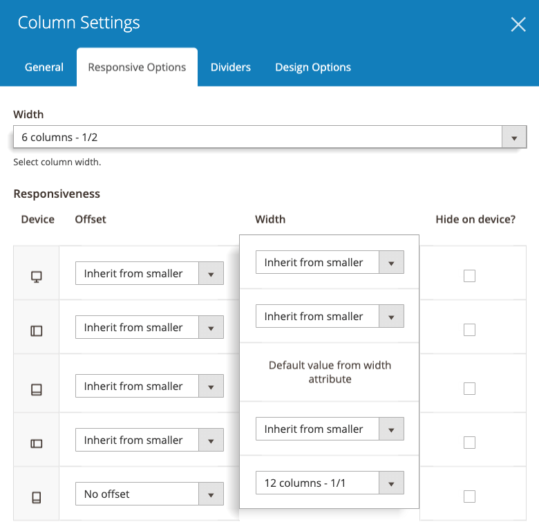
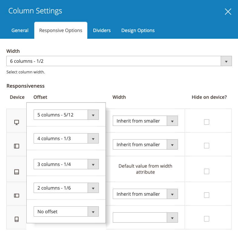
The most simple way to make your layout responsive is set a certain value for column width in Width field on the top. Then set value in Width column like in the image here.
The value in Width field on the top is the value set for Tablet Portrait. For example, we choose 6 columns - 1/2 in Width field on the top, it means that the column width displayed in Tablet Portrait is ½.
- With Desktop, when you choose Inherit from smaller, it means that the column width in desktop will inherit the column width from smaller device that is Tablet Landscape. As in Tablet Landscape, you choose Inherit from smaller, so the column width in Tablet Landscape will inherit from Tablet Portrait that is 6 columns - ½. Therefore, the column width in Desktop is also 6 columns - ½.
- With Mobile Landscape, when you choose Inherit from smaller, the column width in this device will inherit from smaller device that is Mobile Portrait. In Mobile Portrait, for example, we choose 12 columns - 1/1, so the column width in Mobile Landscape is 12 columns - 1/1.
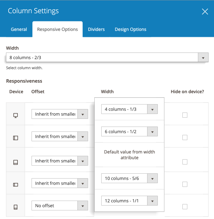
In some special cases, if you want to set different column width for each device, you can choose specific values for each device in Width column.
Define Offsets
The offset works like a blank space that stays between a column and the column before it. And you can define different offsets on different devices.
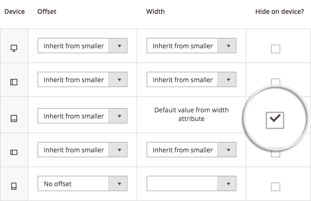
Hide Columns on Specific Devices
Preview Right in Backend
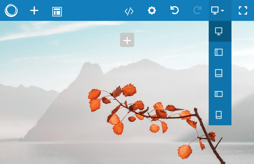
By switching between devices right in the backend, you can preview column sizes and column visibility on different devices.
