Magento 2 Homepage Builder
Elements that should be considered to make an appealing homepage
Through many studies and researches, the first impression of a site usually happens in around the first 50 ms. The home page is likely to be the first address to land on. Thus, the homepage design should be appealing and informative in order to let users go further on the path of purchasing.
If you are wondering what makes a homepage perfect, we are here with this article. This will recommend some main tips to create an attracting homepage. Furthermore, we’ll show the best Magento 2 homepage builder using core functionality and customization.
What is a Magento 2 Homepage?
Magento 2 Homepage is definitely the face of your site. It should contain plenty of goodies targeted that make your visitors move along toward purchasing process. A good point for designing your site is to regard the tendencies and customer claims and experiences.
Well, it's high time to have a look at our Luma Magento 2 default homepage and the components available in the storefront: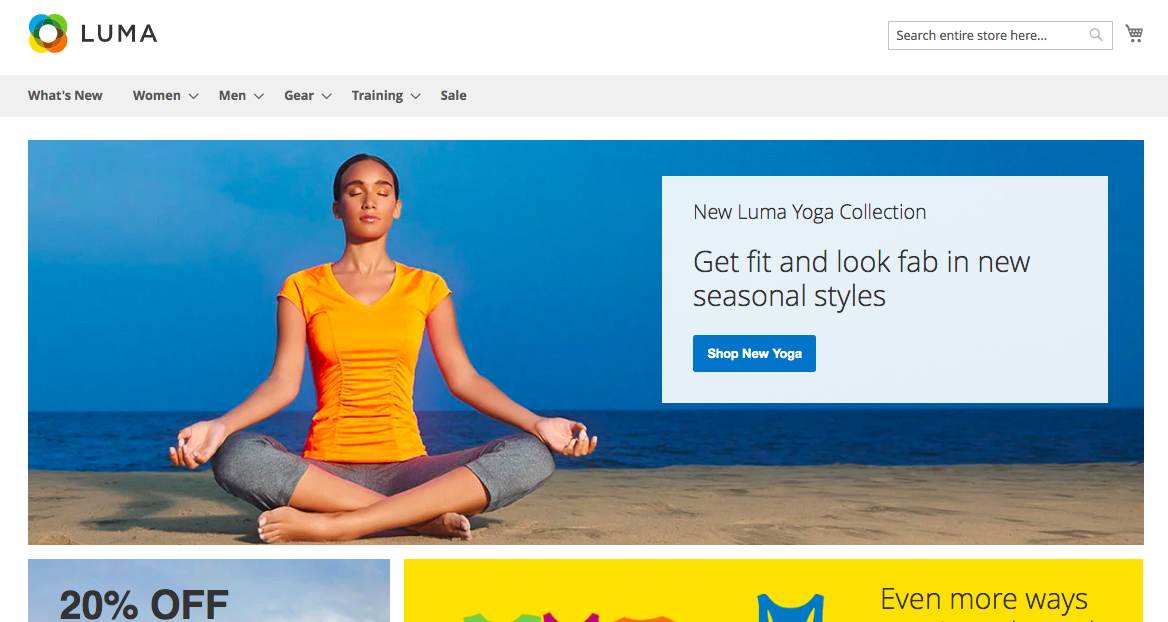
Elements that count
The main menu and the searching area are the vital elements of any web store. In the Magento 2 home page builder, they are prominently placed. Thus, you would like to add as many categories of products to your site as possible in order to keep track of all your goods.
Sadly, it's true that customers today feel tired of a site with the head menu contains too much stuff and doesn't give them any value for shopping. To avoid this mistake, try to make your menu informative, compact, and easy to navigate.
If you've got a large number of different products you may implement a mega-menu. This solution avails you to set up all the stuff in a much tidier way and eases your visitors' eyes while surfing around.
When it comes to the header, things that should be placed here are links to account sign in. Or there will be an area to enter the personal data of a client, order history, wish list, and so on.
The main part of the homepage is CMS blocks with various information: highlights, promotions, sales, brands, etc.
Featuring brand on your homepage could be a good idea to promote yourself if your business recently appeared in the market. The logo identifies the brand needs to be clear and simple that make your customers recognize you better.
How a typical and successful E-commerce website looks?
If it's the first time for your visitors coming to your site, their main goal is to spark their interest. Make them continue exploring the store. To do this, the whole layout has to solve your customers’ real problems. Show them who you are and what the company does. Thus, the popular structure will contain the following blocks:
1. Header
2. Product presentation
3. Other elements
4. Footer
1. Header
The header should bear the answer to the question: Which problems can your site help customers solve?
Doing this correctly can engage people having these problems to stay on your site. Be sure that the answer should be short and clear. Just do it in one or two sentences, not more.
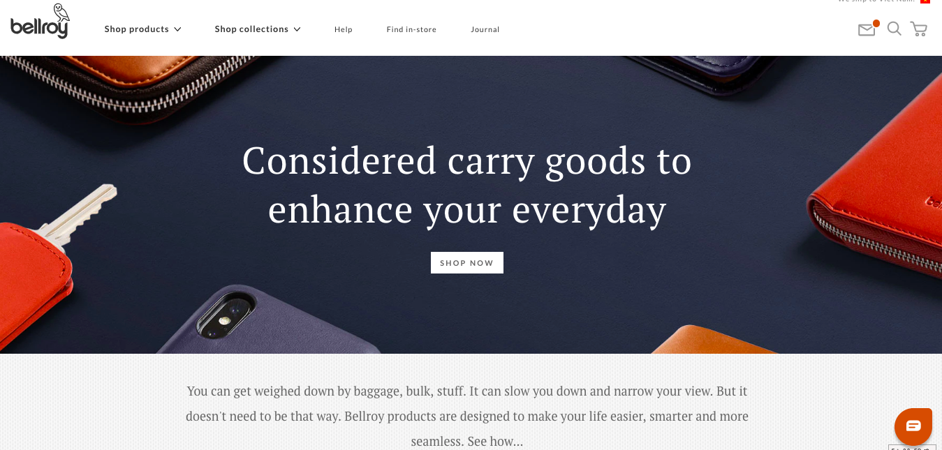
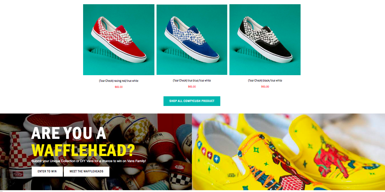
Why don't take a look to the headline of this Magento homepage?
Well, the headline and the banner are really attractive and hit the audience's target directly. "Considered carry goods to enhance your everyday"
No need to express exactly what you do in some cases, maybe it only needs to feature some certain brand or new arrivals you want to sell at first.

Wanna make stunning header with image slider or something like that?
Try Magento Hompage builder and follow the above tutorial.
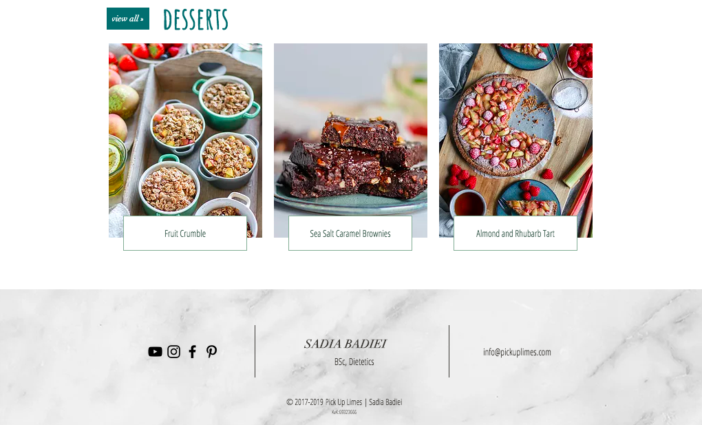
2. Product presentation
Note, never get your visitors bored with long sentences that do not make sense. Grab their attention with your interesting products’ image, price, label and so on. This block can be easily created with elements of Magezon Page Builder. Present the best-in-town product that you highly recommend using Single Product element. Otherwise, if you get tons of featured ones to be displayed, Product list or grid may be good choices.
Take a look through this example:
3. Layout and elements
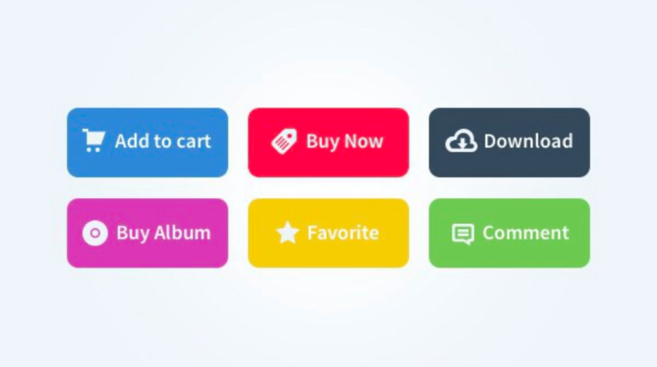
a, Call to action
With the Magento 2 home page builder, you can easily place buttons in your site to make it really professional, believe us!
Why? they are the direct and fastest way to reach what you are selling. Or if you want customers to follow just what you do, they definitely are the directions indicator on a road letting visitors know where to go next.
The text of buttons should be precise and short just like “Shop now”, “Shop”, “Buy”, “View product”, “Buy now”, or “Get a discount”, etc. This will be magical orders that your visitors likely to follow.
b, Illustration & logo
Try to find the right balance and let your site as beautiful as possible.
Never skimp on the illustrators of the page. A Vivid, high-quality banner can absolutely appeal to people. As it attracts your visitors at first sight, everything after that seems to be much easier.
On the other hand. too many and too heavy graphics slow down the page speed. Be sure you compressed all the images before uploading them.
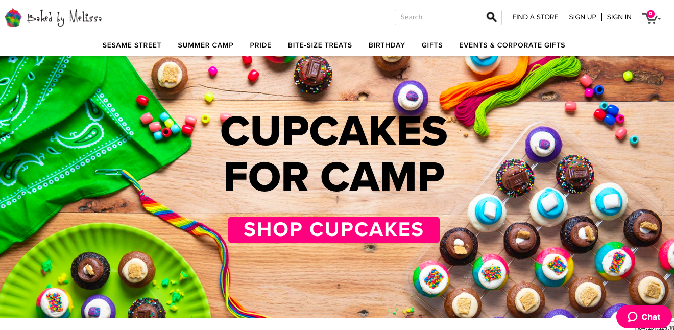
Check out the instance of Baked by Melissa‘s online store. Specialized in cupcakes, this fact is clearly expressed on the home banner. Plus, this also answers the question of what will customers get instead of having a heading. This case, the heading added may just serve as another call to action message.
Video or animated images will be good ideas for the banner as they definitely give more joy and attract more attention. Accompany with the trendy dynamic content can even make your store undefeatable.
4. Footer
In some cases, it should be the duplicate of the header. However, as it is the last chance to convince a user to stay on your store and buy more, you should do something wiser. A thank you block, testimonials, subscription or payment methods or anything you would like to show your own identity.